The importance of visually examining your data
How should an airport executive describe their airport’s traffic flows?
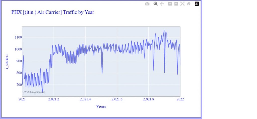
Unlike data captured in a lab environment, aviation data can be very asymmetric; it can have little resemblance to data that is reasonably characterized by basic measures such the the mean and standard deviation. To illustrate this, consider the following image of the daily IFR counts at Phoenix Sky Harbor.

How should this be summarized? One can always calculate a mean and a standard deviation, but clearly the data has non-random components. There are very obvious weekly cycles, and a strong seasonal effect with reduced traffic early in the year, with a relatively sharp increase to somewhat constant levels for the remainder.
In cases like this, it is very important to show the time-series to best convey the nature of the patterns.
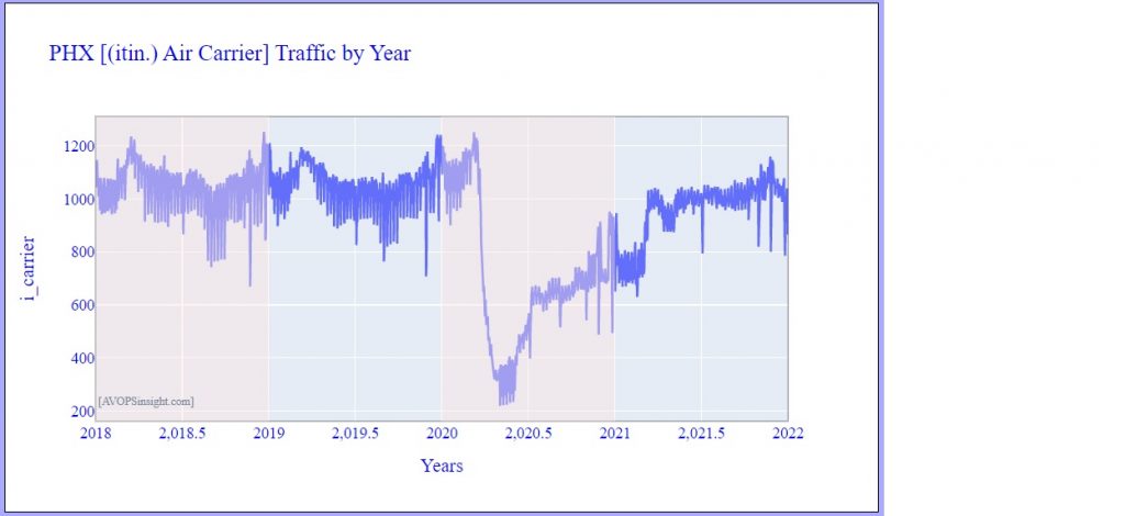
But there is something odd about the first figure – it is telling us that there was less traffic in the winter than in the summer – for one of the hottest places in the U.S. To understand what’s going on, look at a longer timeframe and include the previous three years…

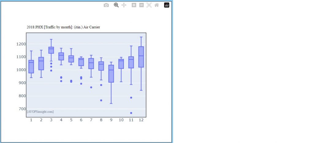
Now we have our answer – in 2021 PHX was still recovering from the effects of the pandemic, and we see from earlier years, there was indeed less traffic during the summer months. This is confirmed by the monthly chart for PHX 2018:

Visual inspection also alerts us to other features. First, there is a surge of traffic at the end of each year around the holiday season. Second, regular holidays such as July 4th and Christmas Day, have distinct drops. Third, there was a greater range of activity in the pre-pandemic years, with a sharp midyear weekly variation increase. Any of these features might involve economic factors beyond the airport’s control, perhaps including a major airline setting up a base of operations, or scaling back to emphasize weekend service.
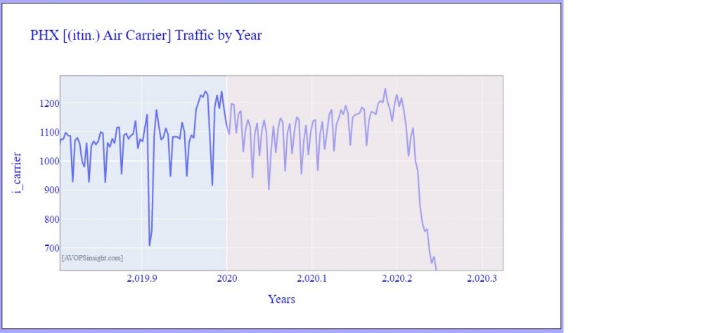
By using the cursor on the ATADS dashboard, we can quickly quantify these features. First select a rectangular region of interest with the cursor to zoom in – this will result in a diagram like the following:

We could use the cursor to get more precise numbers, but visually we can see the weekend peak operations increase from about 1100 per day to about 1220 per day – a 10 percent increase.
With our dashboard, it is possible to quickly and quantitatively answer questions such as: How did the traffic change over the holiday season? On the holiday itself? Is it busier on weekends or weekdays? Is it busier in the summer or the winter? And, remember, our charts can be incorporated into reports, emails, and website pages by either cutting directly from the screen or by using their download button on the top right corner:

