Quantifying Data
The ATADS dashboard allows users to determine linear and quadratic polynomial fits to the data.
All such regressions are best used to quantify existing trends, and can give some reasonable guidance for the near future.
All regressions must be taken ‘with a grain of salt’ since they are vulnerable to unanticipated economic/political and environmental (pandemic?) down turns. The establishment or failure of an airline at a small airport requires more careful consideration than simply clicking a dashboard button.
Linear models, based on a multi year interval, probably give the most reasonable characterization of current behavior and could be reasonably trusted to forecast for a few years in the future. The ATADS dashboard offers a quadratic model, but beware of trusting them beyond a few years out.
When presenting linear model results, it provides a sanity check to show the chart with regression model to support the reported model. To avoid clutter, a smoothing interval should be selected to suppress weekly cycles, and the raw data turned off, as illustrated in the following three charts showing the raw, raw plus smoothed, and smoothed versions:
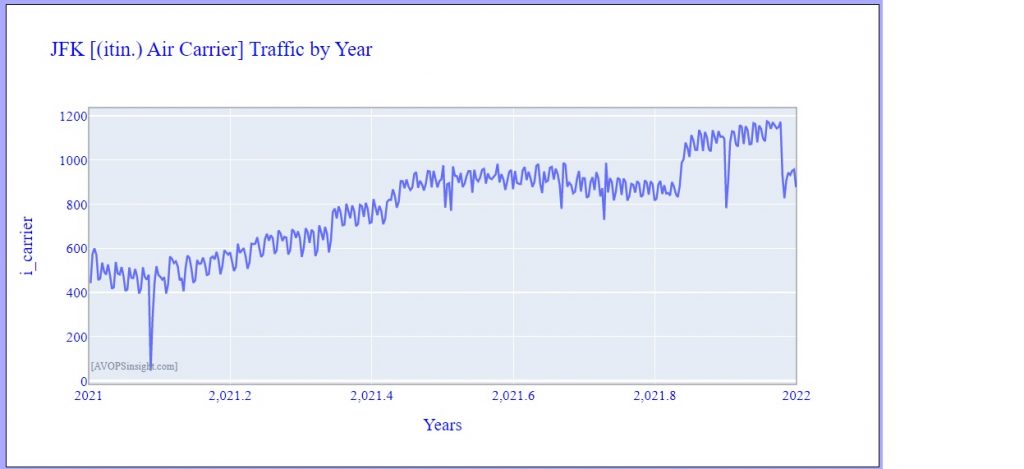
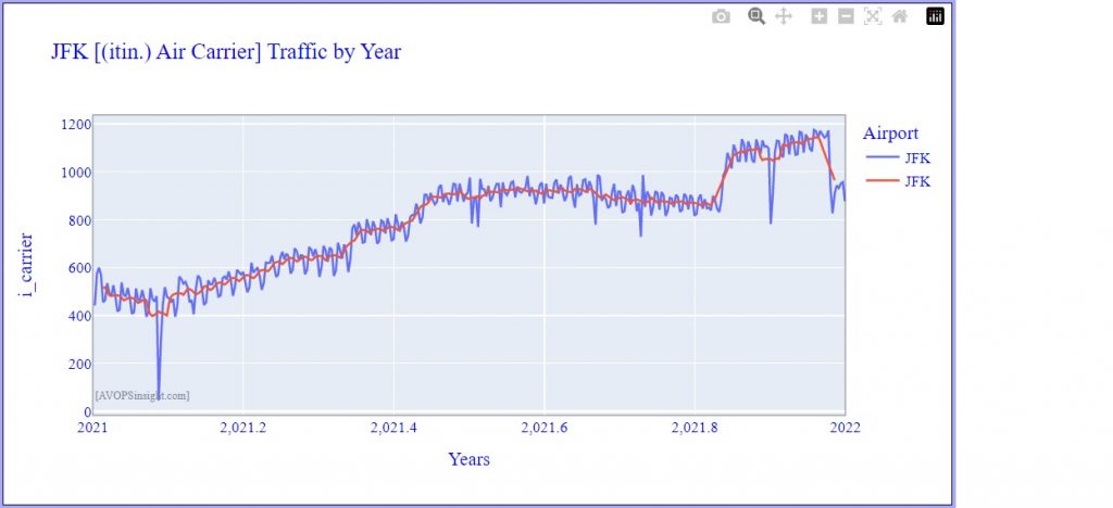
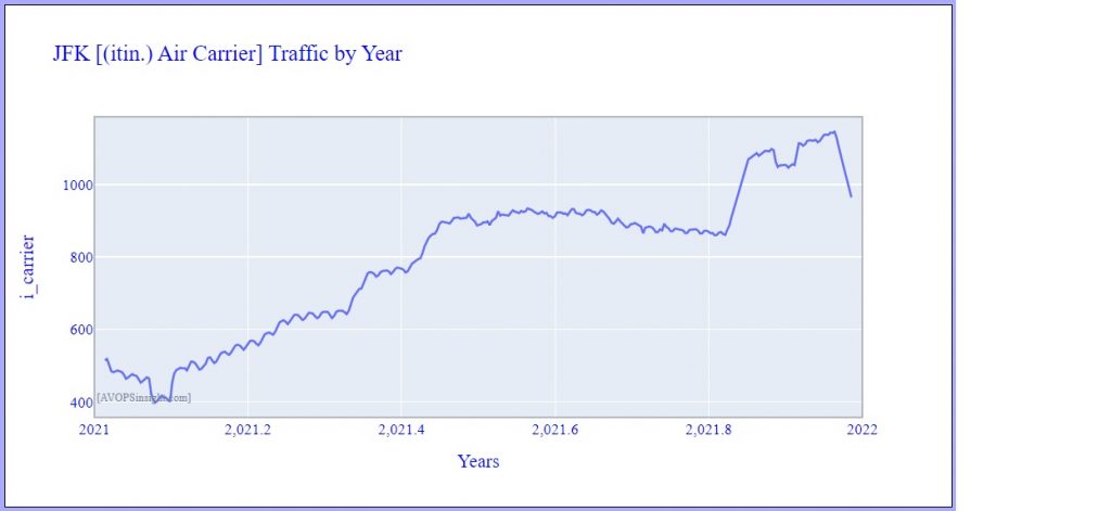
Note how this one year of post-pandemic operations suggests an annual growth rate of almost 600 operations!
Using a 4 year baseline, and selecting a liner model for JFK, results in the following chart:
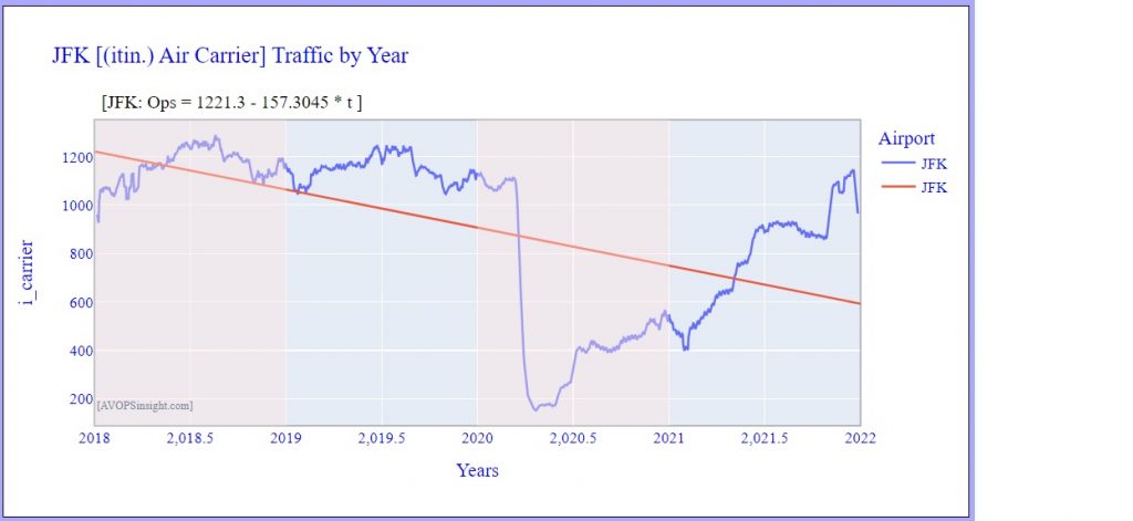
The regression formula on the chart tells us that over the covered period 2018 – 2021, the daily (Itin)IFR Air Carrier ops declined by 157 ops per year.
What was happening before the pandemic? Consider years 2017 – 2019:
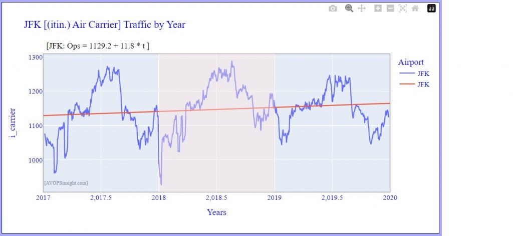
Now the analysis shows an annual growth rate of 11.8 additional ops per year.
So, always visually check your data before interpreting regression models, and including a chart with the model makes your model more acceptable to your audience.
And finally, since the pandemic will be affecting such models for a few years to come, it should be noted one could certainly apply a model to the worst of the pandemic to document post pandemic recovery and to compare current levels with pre-pandemic ones.
